Who Speaks First: Making Your Shopfront Sign and Window Display Pull in the Same Direction
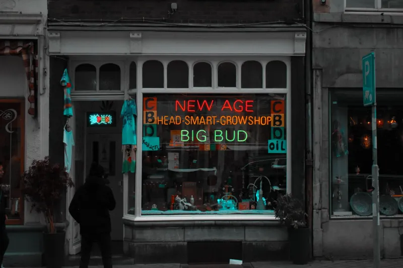
Somewhere between the pavement and the till, a shopfront gets about the length of a traffic light to make its case. On a busy high street that is generous. On a quiet one it is closer to two. Either way, the sign and the window are doing the same job at the same moment, and most of the frontages we are asked to sort out are not suffering from bad taste. They are two good ideas competing for the same glance.
The eye reads in layers, not in logos
Stand on any parade of shops and notice the order in which you take things in. First the shape and colour of the fascia, then whatever is brightest behind the glass, then the detail - the name, the opening hours, the handwritten note about the sourdough.
That order is contrast doing its work, and it does not care about your brand hierarchy. Which is why a loud fascia above an even louder window cancels itself out. Picture a strong, blocky fascia colour with a row of full-colour posters at eye height behind the glass: from ten paces it reads as a wall of noise, and the shop name - the one thing that had to land - is the quietest thing in the frame.
The fix is rarely a new sign. It is usually a quiet band: a strip of clear glass, a plain painted margin below the display, a solid backdrop behind the products. Give the fascia some silence to sit in and it will finish its sentence.
Three speeds, three jobs
A high street is read at walking pace, from a passing car, and from a bus that is not stopping. Those are three different demands, and they should not be answered by the same piece of typography.
At walking pace, people read. A considered typeface, decent spacing and a short line about what you actually do will land properly. At 20mph, nobody reads a sub-line - they register a shape, a colour and perhaps four letters. From a bus, they get the silhouette and the simple fact that a shop exists there.
The practical consequence is a division of labour. Name on the fascia. Explanation in the window. A third, closer layer for the pedestrian already walking past - an A-board, a menu case, a projecting sign that catches the eye at right angles.
As a starting point for legibility, allow roughly 25mm of cap height for every 3m of viewing distance, then add a third for comfort. A fascia read from across the road at 15m wants letters around 125mm; something read from 30m wants closer to 250mm. What that rules out, quickly, is the paragraph of services at 150mm cap height - which looks like a letterhead from the other side of the street and like shouting from directly underneath.
Readability is a floor, not a ceiling
Legibility rules get you to the minimum. Character is what makes a sign memorable. A shop that sets its name in something narrow and slightly odd, generous with space, will be recognised before it is read. That is the whole game on a high street where six other frontages are in the same line of sight.
So keep the type count to two. One for the name, one for everything else. Resist the third, which is nearly always a mistake born of someone adding a strapline late in the process.
After dark, the window becomes the sign
From late October through to March, a good chunk of high street trade happens under artificial light, and by half four the frontage is doing a completely different job. In daylight the sign is reflective; at night it is a light source, and the window behind it becomes a glowing rectangle that either supports it or swamps it.
A few things worth deciding early. Halo-lit built-up letters throw a soft outline onto the fascia and look confident on dark backgrounds; face-lit letters punch harder but can glare. Inside, a bright, even wash of the display will read better from the street than a cluster of hot spots, and a dim interior behind a lit sign makes a trading shop look closed.
Put the window lighting and the sign lighting on the same timer, or at least on timers that agree with each other. A sign that switches off at nine while the window glows until midnight looks like an oversight, because it is one.
Four habits that stop a frontage fighting itself
Draw the whole elevation, not just the sign. One drawing showing fascia, window, door, pilasters and pavement tells you instantly whether the proportions are working. A sign designed in isolation on a white artboard almost always comes out too deep for the fascia it has to live on.
Photograph the frontage at three times of day and look at the pictures side by side. Most conflicts show up in the afternoon shot, when the sun is on the glass and the display is a mirror.
Set a contrast budget before anyone designs anything. Decide which element is allowed to be the loudest, and hold everything else below it.
Leave a margin. A painted or clear band around the window graphic - even 100mm - gives the eye a place to rest and makes the whole frontage look more expensive than it was.
Where design ends and making begins
None of this is complicated, but it does need to happen before the order goes to the workshop rather than in the week after installation. A site survey that measures the fascia depth, the glazing bars and the door reveal will settle most of these questions on the spot. And because we make in the UK, a change of mind caught at the drawing stage is still a conversation rather than a skip.