Measure Twice, Quote Once: The Brief That Keeps Your Signage Budget Honest
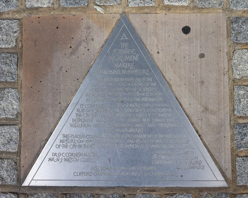
Photo: The wub, CC BY-SA 4.0, via Wikimedia Commons
There's a particular kind of email that lands in every sign-maker's inbox: "Hi, we need a new sign for the front of the shop. How much?" It's not a bad question. It's just that there are roughly forty possible answers, and every one of them has a different price tag attached.
The brief is the cheapest part of any signage project. It's also the part that decides whether your quote is accurate or whether you spend the next three months paying for variations, remakes and second site visits. Get it roughly right and everyone — you, the sign-maker, the person holding the drill — has a calmer time of it.
Why the vague brief is the expensive brief
When a sign-maker quotes from a single sentence, one of two things happens. Either they price in a healthy margin for everything that might be true — listed stone walls, restricted access, an awkward fifth-floor fascia — or they quote low to win the job and discover the complications later, at which point somebody has to pay for them. Usually you.
Ambiguity also creates revisions. Three rounds of "can we see it a bit bigger?" costs design time. A logo supplied as a 400-pixel screenshot costs redraw time. A wall that turns out to be render over crumbling brick costs a fixing rethink. None of that is anyone being difficult; it's just information arriving too late.
Seven things worth gathering before you email anybody
You don't need to know the answers. You need to say what the situation is, including the bits you're unsure about.
1. Size. Width and height in millimetres, and where you measured from. "About two metres" is a starting point; "2,400mm wide, measured between the two drainpipes either side of the door" is a brief.
2. Position and fixing height. Centre line from the pavement, distance from the door opening, depth of the fascia, whether the sign sits above or below a first-floor window. This affects both legibility and whether you trip over planning rules — maximum letter heights in some conservation areas are unforgiving.
3. Photographs. Three minimum: a wide shot showing the whole building, a close-up of the exact wall or fascia, and a shot that includes neighbouring premises so the sign-maker can judge context and visual weight. Tape a ruler or an A4 sheet to the wall in one of them. It looks daft and it works brilliantly.
4. Mounting surface. Brick, painted render, timber cladding, aluminium composite panel, glass, steel, stone, a roller-shutter box, the underside of a canopy. Note whether drilling is allowed and, if you're a tenant, whether it's the landlord's wall.
5. Brand assets. Vector files wherever they exist — AI, EPS, SVG or a press-ready PDF. Pantone or RAL references if you have them. Say plainly whether fonts are licensed or whether you'd like the lettering matched. A JPEG of the logo pulled off the website is not a brand asset; it's a rumour.
6. Access. Where a van can park, whether the pavement is pedestrianised, whether you'll need a cherry picker or scaffold, what hours work is permitted, whether the building is listed, whether the landlord needs to approve anything.
7. Deadline and the reason for it. "ASAP" tells a sign-maker nothing. "Before the Christmas lights switch-on on 28 November" tells them everything, including how much they can help you and how much they can't.
Photos do more work than paragraphs
Most of the questions a sign-maker will fire back at you are answered by a decent set of photographs. Take them on a dry, overcast day if you can — flat light shows surface texture better than bright sun. Photograph the back of the wall if access allows, so fixings can be judged. Shoot the sign location at dusk as well, because that's when you'll find out whether the streetlamp opposite washes the fascia out or whether an illuminated sign would be doing all the heavy lifting.
If there's a cable, a pipe, an alarm box or a redundant bracket in the way, photograph it. Someone will spot it eventually; better now than on installation day.
Three briefs that actually work
The shopfront. "Single retail unit, 1970s building. Fascia is 3,600mm wide by 450mm deep, aluminium tray currently in place with old letters removed — photo 4 shows the exposed face. We want non-illuminated built-up letters, 180mm cap height, fixed to the existing tray. Vector logo attached; house font is a licensed open-source sans, so no licensing issue. Pavement outside is pedestrianised between 10am and 6pm; landlord is the freeholder, contact in the attached email. Would like it up by the first week of March."
That's nine lines and it will produce a quote you can trust.
The office reception. "We're fitting out a reception in a serviced building. Landlord requires all fixings to be made good on exit, so we'd rather not drill the marble cladding behind the desk — photo 3 shows the recess. Looking at a freestanding brushed stainless panel, roughly 1,800mm high, with our logo in vinyl applied to the face, plus a slim directory plate beside the lift. Brand guidelines attached. We need the design approved by our London office, so build in two weeks for sign-off."
The site hoarding. "48 metres of timber hoarding around a residential development, 2.4m high. We need printed panels with the development identity plus planning and contact information. Site is live, so work has to happen behind the hoarding line with no lane closures; there's a compound gate at the north end. Artwork is with our agency and will arrive in print-ready PDF. Do you need the panels to be removable for reuse on the second phase?"
What they'll probably ask you back
Expect questions about artwork formats, who signs off the design, whether you want a survey visit, whether illumination is required, whether you can supply a site contact for access, and whether there's a preferred installation window. A brief that pre-empts half of these shortens the whole cycle.
A template you can copy
- What it is: type of sign, quantity, where it goes
- Size: width × height in mm, plus fixing height
- Site: address, photos, surface, obstacles, access notes
- Brand: vector logo, colours, fonts, any guidelines document
- Constraints: landlord, planning, conservation area, listed building, working hours
- Deadline: the date, and why that date
- Budget indication: a range is fine, and it stops everyone wasting time
- Approvals: who says yes, and by when
Fill that in, attach six photographs, and you'll get quotes that mean something. Not because sign-makers are fussy — but because a good sign is a small piece of engineering, and engineering runs on dimensions.