Beyond the Blank Sans: Picking Shopfront Lettering Your Brand Can Own
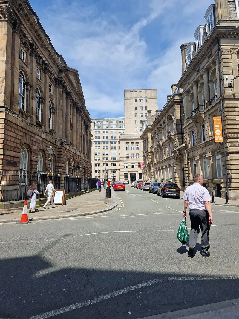
There's a particular shade of grey-blue fascia that has quietly colonised the British high street. You know the one. Rounded corners, a logo in a circle, and underneath it a geometric sans-serif in medium weight, generously tracked, probably all caps. It works for a coffee roaster. It works for a dentist. It works for a firm of solicitors and, somehow, for a fried chicken shop. That's the problem: it works for everything, which means it says nothing about anything.
This isn't a rant about minimalism. Clean lettering has earned its place — it's readable, it's cheap to fabricate, it photographs well for the delivery apps. But there's a difference between choosing a neutral typeface deliberately and defaulting to one because it was already sitting in the template. One is a design decision. The other is a shrug.
Why the sameness happened (and why the reasons were fair enough)
Nobody set out to make every shopfront look identical. It arrived through a series of perfectly sensible decisions. Brand kits got built by people who spend their days on screens, where a typeface is judged at 14 pixels rather than at 14 metres. Sign-makers, asked for "something clean", reached for the fonts they knew would fabricate without fuss. Free and low-cost sans-serifs proliferated, and the good ones are genuinely good.
The result is a high street where typography has become wallpaper. Distinctiveness used to be a shopkeeper's cheapest marketing tool — the hand-painted grocer's lettering that people could describe from memory. Now the lettering is often the last thing anyone notices, and the shop is remembered by the colour of its awning instead.
Distinctive lettering isn't the same as difficult lettering
Here's the fear that keeps people on the safe path: that choosing something with character means choosing something that won't work. Won't route cleanly, won't weed in vinyl, won't survive a decade of Manchester rain.
That fear is worth taking seriously, but it's badly aimed. Plenty of characterful typefaces fabricate beautifully. The trouble usually isn't the typeface's personality — it's a mismatch between the design and the process. A hairline-serifed display face chosen for a logo will fight you the moment it has to be cut from 3mm aluminium. A soft, blobby script looks charming on a jar label and turns to mush on a fascia viewed from the far side of a car park. Those are specification problems, and specification problems have answers.
Legibility is physics, not taste
Before anything else, the lettering has to be readable by someone who is not looking for it. A rough working rule that sign-makers use: about 25mm of capital height for every 3 metres of viewing distance. A fascia read from across a road at 15 metres wants roughly 125mm caps — and that's for good eyesight, decent contrast and reasonable weather.
Beyond size, a few things genuinely matter at distance:
- x-height — generous lowercase reads better than cramped lowercase, which is why so many successful retail fascias are set in lowercase rather than caps.
- Counters — the holes in letters like 'a', 'e' and 'o'. If they close up at distance, the word becomes a smudge.
- Stroke contrast — high-contrast faces (thick thins, thin thicks) lose their thins first. Fine for a book cover, risky at 20 metres.
- Tracking — tight spacing flatters a logo at small sizes and destroys it on a long fascia. Give letters room to breathe.
- Word shape — a distinctive silhouette is remembered even when individual letters blur.
None of that rules out personality. A slightly quirky 'g', an unusual ampersand, a handmade-looking terminal on the 'r' — these read as character without costing legibility, because they live in the details rather than the skeleton.
What the workshop actually worries about
If you want to know whether a typeface will survive fabrication, ask the person who has to produce it. The recurring concerns are consistent.
Vinyl. Thin strokes are miserable to weed, and very fine letterforms can lift at the edges over a few winters. Anything with a stroke thinner than a couple of millimetres needs a conversation about material choice.
Cut metal and acrylic. Counters can fall out. A letter 'a' with a small closed bowl becomes a separate loose piece you have to fix back in, which usually means a bridging bar — and a bridging bar changes the letter. Stencil-style cuts solve it, but they change the look. Better to know before the file goes to the router.
Illumination. Halo-lit and face-lit letters need enough depth and stroke width to hide the hardware and spread the light. Delicate type and internal LEDs are not natural allies.
Kerning. Machine spacing gets you 90% of the way. The remaining 10% — the gap between 'AV', 'LT', 'To' — is what separates a sign that looks made from one that looks printed.
Numerals and punctuation. Check the characters you'll actually use. House numbers, opening times, an apostrophe in the shop name, an ampersand in "Smith & Sons". Plenty of otherwise lovely typefaces have an ugly set of figures lurking in them.
Licensing. A desktop licence is not automatically a signage licence. Large-format use, embedding in cut files and sharing with a fabricator all need checking. It's dull, it's quick, and it's much cheaper than a letter from a foundry.
A practical way to choose
Start with three candidates, not one. Set your actual shop name in each — not lorem ipsum, and not your longest product name either. Then:
- Print them at the real size and stick them on the wall. Look from across the room, then from the far end of the corridor.
- View them in flat grey light, because that's the default British weather for eight months of the year.
- Check the awkward letters. G, Q, the numeral 1, a lowercase 'j' descender.
- Ask your sign-maker which of the three they'd rather produce, and why.
- Consider a small custom move — a tweaked terminal, a bespoke ligature, a slightly redrawn counter — that makes the typeface yours rather than everyone's.
The long game
A fascia is a ten-year decision. That's a long time to spend in a typeface you chose because it was there. Distinctive lettering pays back slowly and steadily: people describe your shop by it, they remember it when they're recommending you, and they find you on a street where everything else has blurred into one grey-blue rectangle.
It also costs almost nothing extra. Type choice is free at the design stage. It only becomes expensive when you change your mind after the panels are up. So spend twenty minutes on it now — the workshop will thank you, and so will the person trying to find you in the rain.