Caught in Passing: How to Make a Sign Land Before the Lights Change
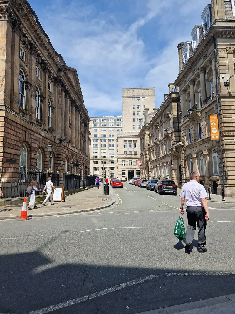
Photo: Frombowen, CC BY-SA 4.0, via Wikimedia Commons
Most signage is designed at a desk, on a large screen, with a cup of tea nearby. That is a lovely way to work. It is also nothing like the conditions in which the sign will actually meet its audience. A driver on a 30mph road gets through roughly 40 metres in three seconds. A cyclist covers maybe 12 to 15 metres. A shopper walking past a pavement sign might give it two steps. If the sign only makes sense when you stop, squint and read every line, it is not doing its job.
At Amr Signs we spend a lot of time looking at proofs, and the most useful question is usually the blunt one: what does this look like when you are already moving? Here is how to test for that, without turning the design into a motorway gantry.
Start with the distance, not the artwork
Before you fall in love with a typeface, work out the viewing distance. A fascia seen from the opposite pavement is a different problem from a totem at a retail park entrance. A rough workshop rule is 25mm of letter height for every 3m of viewing distance. So a sign read from 10m wants letters around 80mm tall; a sign read from 30m wants something closer to 250mm. These are starting points, not laws. Lowercase letters, thin weights and script fonts all need more height to read cleanly.
The three-second test is really a distance test in disguise. If the sign is meant to be read by a driver approaching a junction, the clock starts earlier than you think. If it is aimed at pedestrians, the distance is shorter but the angle is often worse. Either way, design for the person who is half-looking, not the person who has parked up and given you their full attention.
Contrast beats colour every time
A common mistake is to choose a colour scheme because it looks good on a brand board. On a grey November morning, with a wet road reflecting headlights, that soft sage green on cream can disappear. Contrast is what makes letterforms legible: dark on light, light on dark, or a strong solid block behind the type. Mid-tone on mid-tone is the enemy.
A quick check is to turn the artwork greyscale. If the words still stand out, you have a decent contrast structure. If the whole thing turns into a muddy rectangle, no amount of clever typography will save it. This is not about making every sign black and white. It is about making sure the brand colours are doing a job, not just decorating the panel.
The phone-camera test
You do not need a simulator. You need a phone and a bit of honesty. Stand where your customer will actually be: on the pavement, in the car, on the bike. Take a photo or a short video from that position. Then look at the first frame, not the frame you took after standing still for ten seconds.
Better still, take a burst of photos as you walk or drive past at normal speed. Open the first one. Can you read the name? Can you tell what the business does? If the answer is no, the sign is asking too much. Repeat at the three-second mark in a video. The moment when the sign first becomes readable is the moment that matters.
This test is especially useful for pavement signs and A-boards, which are often photographed from a standing position and then placed where people approach at an angle. A board that reads beautifully from directly above is useless if the passing foot traffic sees it edge-on.
Every word pays rent
Clutter is the quiet killer. A fascia with the business name, a tagline, a phone number, an Instagram handle, three service lines and a 'since 1998' badge is not communicating more. It is communicating less, because the eye has nowhere to land.
Think of the sign as a hierarchy. The name comes first. The category comes second, if people need it. Everything else is optional. A bakery does not need to list every loaf on the fascia; it needs to look like a bakery. A trade counter does not need its full service list on the totem; it needs to be findable and credible. If a line of text is not helping someone decide whether to turn in, walk in or look again, it is probably costing you clarity.
Placement on a UK street
The best artwork in the world will struggle if it is in the wrong place. On a high street, signs compete with shopfronts, street furniture, parked vans and listed buildings. In a conservation area, the planning authority may have views on size, illumination and materials, so check before you order. A pavement sign needs to leave enough footway for wheelchairs, prams and delivery trolleys; it also needs to be visible from the direction people actually approach, which is often not the direction the designer imagined.
For totems and monoliths, look at the approach speed and the sightline. A sign at a retail park entrance has a different job from a sign above a door. If it is read from a car, keep the message short and the contrast high. If it is read on foot, you can afford a little more detail, but not much.
Before and after, without losing character
Picture a café with a dark green fascia. The original has a delicate script logo, the words 'artisan coffee and kitchen', a phone number and a small illustration of a coffee bean. From across the road it reads as a green blur. The revised version keeps the green, keeps the script for the logo mark, but sets the name much larger and adds a single line in a clean sans serif: 'Coffee · Kitchen'. The phone number moves to the window. The character is still there; the message now arrives.
Or take a trade park totem that listed eight services in equal weight. The new version uses the company name at the top, one line underneath saying what it sells, and a directional arrow. Nothing fancy. It works because the hierarchy does the work.
A five-minute checklist
- Stand where the customer stands, at the speed they move.
- Check the first frame of a photo or video, not the tenth.
- Turn the artwork greyscale and look for contrast.
- Count the messages. If there are more than two, cut one.
- Check letter height against viewing distance.
- Look at the sign in context, including obstructions and approach angle.
- Ask someone who has never seen it to tell you what the business does.
A sign has a short window to do its job. Designing for three seconds is not dumbing down; it is respecting the person on the other side of the glass. The best signs are not the busiest. They are the ones that land before the lights change.