The Van Is the Poster: Livery That Reads at 30, 50 and 70
Most signs wait for an audience. A fascia sits above a door and hopes someone looks up. An A-board stands on the pavement and hopes the wind behaves. A van does neither. It goes to the builders' merchant, the retail park, the school gate and the motorway services. It gets seen by people who never walk past your premises. Yet vehicle graphics are often treated as the last item on the list — something to sort out once the shopfront is finished and the budget is nearly gone.
That is a missed trick. Your van is probably the most travelled sign you own. It should be designed like a sign, not like a poster that happens to be stuck to a door.
Start with the rear doors
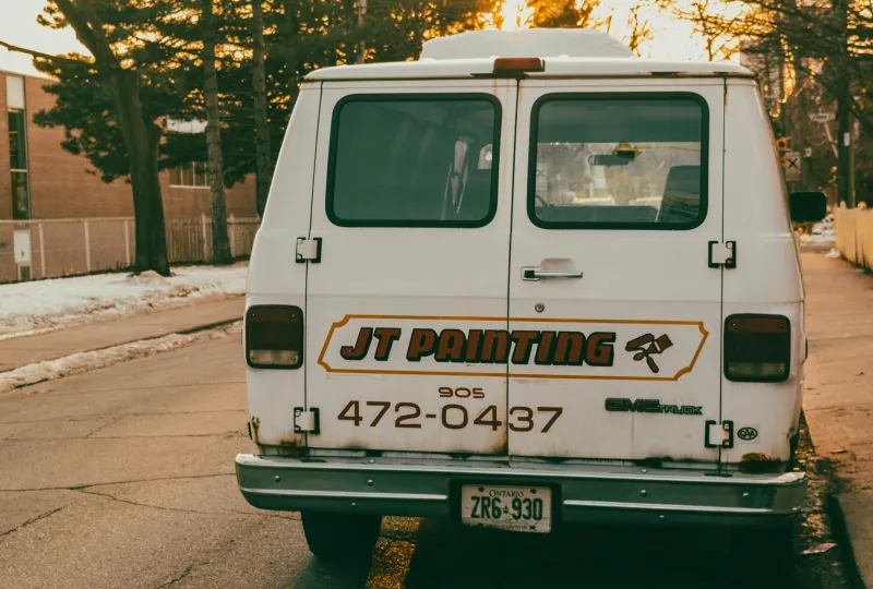
When people are stuck behind you at traffic lights, the rear of the van is the part they study. It is also the view most likely to be photographed, remembered and repeated. So give it a clear job: who you are, what you do, and one way to get in touch. That might be a phone number, a website or a short phrase that does the selling for you.
What it should not be is a collage. Tiny text, three service lists and a QR code at ankle height will not survive a wet Wednesday on the A34. At the rear, contrast and hierarchy matter more than completeness. If someone can read your name and your trade in two seconds, the sign is working.
Design for three distances
A van is viewed at roughly three speeds. Around town, people see it at walking pace or 30 mph. On an A-road, they get a longer look at 50 mph. On a motorway, they get a shape and a colour at 70 mph and very little else. Good livery works at all three.
At 70, the vehicle should be recognisable by silhouette and palette alone. At 50, the main message should land. At 30, there is room for a phone number, a website or a simple call to action. If the design only works when the van is parked, it is not really livery. It is a billboard with an engine.
A useful test is to take a photo of the proposed layout, shrink it to the size of a thumbnail and squint. If the van turns into a smudge of colour with no readable name, the design is too busy. If it turns into a strong block of brand colour with one clear word, you are getting somewhere.
Keep it in the family
Livery should feel related to your fixed signage. That does not mean copying the fascia and stretching it down the side of a Transit. A shopfront is vertical and close-up. A van is horizontal and moving. The same brand cues — typeface, colour, logo shape, tone of voice — should be present, but the layout has to adapt.
Think of it as the same person in different clothes. The van can be bolder, simpler and more graphic than the shopfront because it has less time to make its point. But it should not look like a different business. If your shopfront is quiet and typographic, a full-colour cartoon mural on the van will feel like a stranger. If your brand is bright and energetic, a single grey door decal may undersell you.
Partial wrap or full wrap?
A full wrap covers most of the vehicle in printed vinyl. It gives the strongest visual impact and can make a plain white van look like a proper brand asset. It also costs more, takes longer to fit and needs more care when it is removed. If the van is leased, check the terms before you cover every panel. If you plan to sell it in three years, ask how the wrap will come off and whether the paint underneath will match.
A partial wrap is often the sensible middle ground. Colour blocks on the lower panels, a strong logo on the doors and a clean rear door panel can look more considered than a full-body design that tries to say everything. Cut vinyl lettering is cheaper again and works well for simple names, phone numbers and web addresses.
And sometimes a single door decal is the strongest choice. A white van with one well-set sign on each front door can look sharper than a busy full wrap. It says the business is confident enough not to shout. For a small fleet, consistency matters more than coverage: the same door decal across three vans will build recognition faster than three different full wraps.
Mind the windows
Windows are tempting because they are flat and visible, but they are not free real estate. Keep the driver's view clear. Do not cover the front side windows in a way that affects mirrors or visibility. Rear window graphics can work, especially perforated vinyl that lets you see out, but check the legal and insurance position before you rely on them. More importantly, do not put essential information only on a window that may be covered, dirty or reflecting the sky.
A good rule is simple: the main message belongs on solid bodywork. Windows are for support, not for the punchline.
Build for British weather
British weather is not dramatic. It is persistent. Rain, road salt, UV and frequent washing all take a toll on vehicle graphics. Cheap calendered vinyl may look fine on day one and tired by the end of the second winter. Cast vinyl, properly laminated, is usually the better bet for curves and long-term appearance. Edges need to be finished cleanly, because that is where dirt and water get in.
Think about the parts of the van that take the worst of it: wheel arches, sills, rear doors and the lower panels. If the design puts delicate lettering there, expect it to age first. Reflective markings can be useful for rear chevrons or safety panels, especially if the van works at night or on sites. Keep them intentional rather than decorative. A little reflection at the right point looks professional. A lot of it looks like a fairground ride.
The moving shopfront test
Before you sign off the artwork, do three things. Park the van twenty metres away and look at it. Take a photo and view it on your phone. Then look at the rear doors in a wing mirror. If the name, the trade and one contact route are clear in all three views, the livery is doing its job.
A van is not a poster. It is a moving shopfront with a very short attention window. Design it for the glance, build it for the weather, and it will keep earning its miles long after the fixed signage has gone home for the night.