Nobody Asks Twice: Auditing Indoor Wayfinding One Decision Point at a Time
There's a particular look a receptionist gets when they've been asked for the third time before ten o'clock where the finance team sits. It isn't annoyance, exactly. It's the look of someone who has become a human sign because the building didn't make one.
If that sounds familiar, your internal wayfinding has quietly stopped working. Not dramatically — nobody complains about it — but slowly, in a laminated, blu-tacked sort of way, where every new starter, every relocated department and every "temporary" A4 printout adds another layer of noise to a corridor that used to be clear.
Walk it the way a stranger walks it
The most useful audit tool isn't a spreadsheet. It's a person who has never been inside your building. Borrow a supplier, a new starter on day minus one, a friend from another office. Give them a destination and a time limit, then follow two paces behind with a notebook.
And don't help. That's the whole discipline: resist the urge to point.
You're watching for hesitation rather than confusion. A visitor who stops, turns their head and picks the wrong corridor hasn't failed — the building has. Those pauses mark the exact locations where a sign should already be doing the work.
Do this on a busy Monday if you can, because a building that reads perfectly at 8am on a Sunday is a different animal when there are two deliveries at the door, a wheelchair user waiting for the lift, and a queue forming at the signing-in tablet.
Every junction is a question
Wayfinding isn't decoration. It's a sequence of small questions, and the job is to answer each one slightly before it gets asked.
Think of the route as a chain: arrival, entrance, threshold, junction, lift lobby, floor arrival, final door. At each stage someone is choosing a direction. A sign that appears after the choice has been made is a sign that failed.
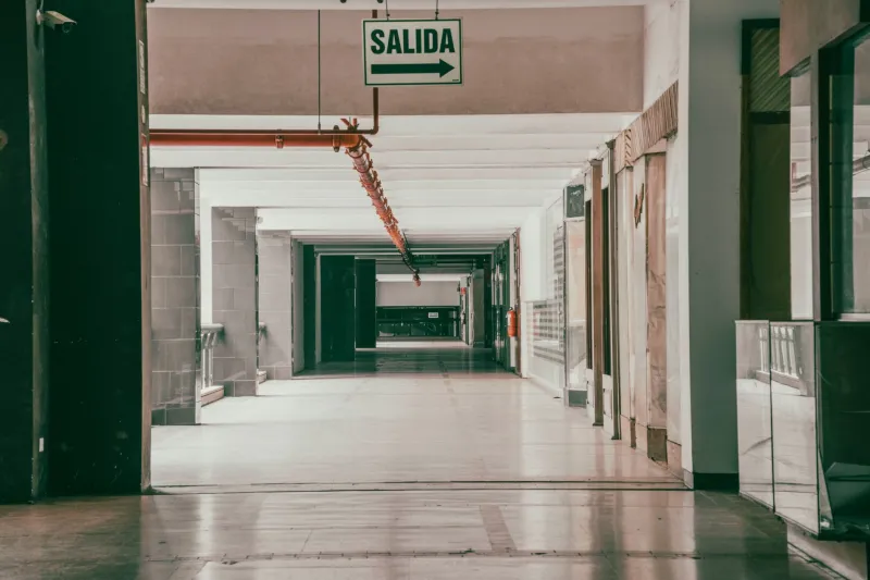
The practical rule: signs belong on the approach to a junction, in the line of sight of someone walking towards it — not around the corner, and not above the fire door they've already walked past. If your directional fingers are mounted at 90 degrees to the approach so a walker only ever sees them edge-on, you've built a sign for people who already know the way.
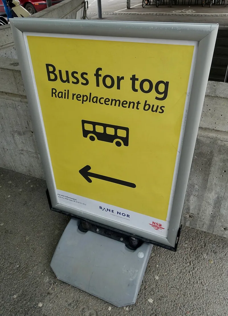
Arrow logic catches people out too. A single arrow pointing up is ambiguous: straight ahead, or upstairs? Pick one convention and never break it. Most British sign systems use up for straight on and reserve a diagonal for stairs, with the stair destination named alongside. Which convention you choose matters far less than sticking to it.
Reception isn't a shrine, it's a junction
Reception signs have a habit of becoming logo walls — a large brand mark, a mission statement, and absolutely no information about where anyone actually is.
That's a waste, because reception is the highest-traffic decision point in the building. A brand sign there is right, and it should look like a relation of the exterior fascia: same typeface, same palette, same visual weight. But it needs a partner — a clean directory, a correctly oriented floor plan, and an obvious sightline to the lifts. If you've got a "you are here" map, check it's drawn from the viewer's orientation rather than the architect's. Nothing drains confidence faster than a plan that puts the entrance at the top when the door is behind you.
For clinics and schools, reception is also where people arrive anxious. Cut the reading load: fewer words, bigger type, one clear "report here" instruction.
Build a kit of parts, not a collection of signs
The reason internal signage drifts is that it's bought in ones and twos, by different people, at different times. Someone orders door plates. Someone else adds a projecting sign. A department head gets a vinyl banner made on a Friday.
The fix is a small, boring, genuinely lovely thing: a kit of parts. One typeface family. One palette, with a defined high-contrast pairing for text and background. One mounting datum — all wall-mounted directional signs centred at the same height throughout, room plates at door height. Two or three plate sizes, no more. One arrow set. One fixing method, so nothing looks bolted on as an afterthought.
Once the kit exists, adding a sign becomes a specification exercise rather than a design decision. That's the point. A facilities manager can order a replacement without ringing a designer, and the corridor still looks like it belongs to the brand above the door.
Heights, contrast and the bits that actually bite
Accessibility here isn't a bolt-on — it's the same discipline wearing a different hat. Approved Document M of the Building Regulations and BS 8300 give a working baseline for accessible signage, and the Equality Act 2010 gives you the reason to care in the first place.
Worth writing into your spec:
- Room plates mounted with their centreline roughly 1400mm to 1700mm from the floor, on the wall on the latch side of the door, set back slightly from the frame so they're readable by someone standing at the handle.
- Tactile lettering and Braille on plates identifying permanent rooms — raised characters, not etched ones.
- Real tonal contrast between lettering and background. A mid-grey on a slightly different mid-grey isn't contrast, it's camouflage.
- Directional lettering sized for the distance: as a rough guide, allow about 25mm of letter height for every 3 metres of viewing distance, and add a size for busy visual backgrounds.
- Nothing protruding at head height along a circulation route, and nothing that eats into a wheelchair turning space or blocks a handrail.
Give the corridor an owner
The last piece is the least glamorous. Someone has to own internal signage. A named person, a shared document, a short spec, and a rule that no new sign goes up without passing through it.
That's what stops the laminated A4. Not good taste — a process.
The Monday after
Come back to the building on a Monday, a month or so after the new signs go in. Stand near reception with a coffee and watch. If people are walking rather than asking, the job's done. If someone still stops, turns their head and squints down a corridor, you've found your next decision point — and it's a far cheaper thing to fix than a shopfront.