The Blue That Isn’t Quite Blue: Matching Brand Colour Across Signage Materials
You have picked the blue. It looked right on the brand guidelines PDF, right on the website, right on the laptop screen. Then the samples come back and suddenly there are three blues: one on the acrylic, one on the door vinyl and one on the powder-coated fascia. None of them is wrong, exactly. They are just doing what materials do.
Colour on signage is not a single decision. It is a series of translations. A reference number becomes a sheet of acrylic, a roll of vinyl, a pot of powder, a printed panel or an illuminated face. Each route has its own surface, thickness, gloss level and way of bouncing light back at you. The trick is not forcing every material to look identical. It is getting them close enough that nobody stops in the street and asks why your shopfront has two different blues.
Why the same reference lands differently
Acrylic is coloured through the sheet, so the blue you see is influenced by the pigment, the sheet thickness and whether it is cast or extruded. A thin face behind a light box will read differently from a solid 5mm panel screwed to a wall. Vinyl is a film with a colour layer and an adhesive, often finished with a gloss or matte laminate. Change the laminate and you change the way the colour behaves. Powder-coated aluminium is a cured polymer film over metal, and the texture, gloss level and bake can all nudge the final tone. Illuminated letters add another character entirely: the face material, the diffuser, the LED colour temperature and the brightness all have a say.
Then there is metamerism, which is the fancy way of saying two colours can match under one light and disagree under another. A blue that looks right under the fluorescent tubes in your office may look greyer under an overcast sky and slightly purple under warm pub lighting. In the UK we get a fair amount of overcast sky, so this is not a theoretical concern.
Start with a reference everyone can argue with
Do not brief a sign-maker with the phrase our blue. It is not a specification. If your brand guidelines give a Pantone reference, give the coated and uncoated version and say which one is the intended match for signage. If you have a RAL reference for powder coating, pass that on. If your guidelines only have a HEX code, ask your designer for a physical reference before you go any further. Screen colours are made of light; signage colours are made of materials.
It also helps to agree what good enough means. A perfect match across acrylic, vinyl and powder coat is not always realistic. A sensible tolerance, agreed in advance, is much better than a last-minute argument on installation day. On a fascia viewed from across the road, a tiny shift may be invisible. On a reception wall where people stand a metre away, it may matter more.
Ask for a physical sample, not a screen preview
This is the step people skip when the programme is tight. Please do not skip it. Ask for samples made from the actual material and finish you are buying, not a digital render and not a paper swatch pretending to be acrylic.
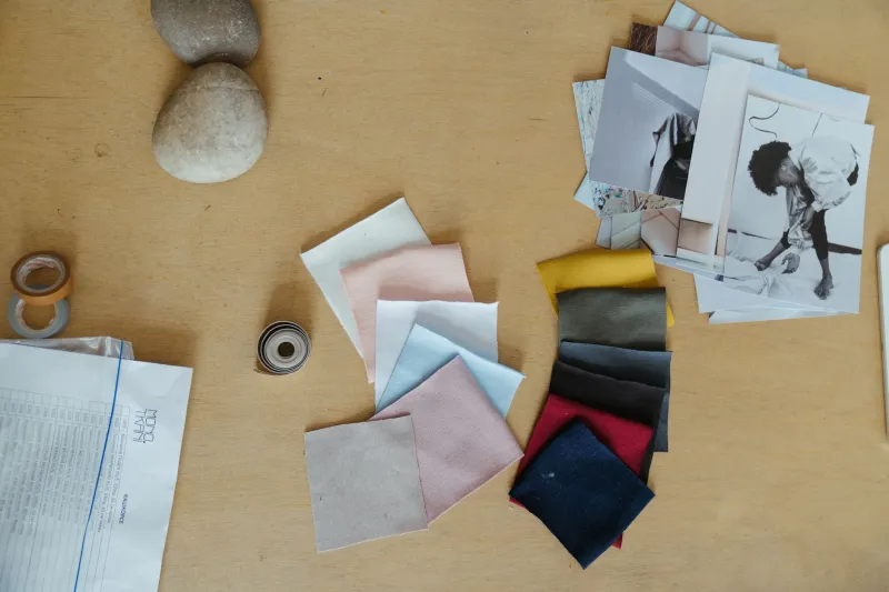
For vinyl, ask for an offcut from the same series and laminate. For powder coat, ask for a coated aluminium chip or offcut finished with the same powder and cure. For acrylic, ask for a small offcut of the sheet. For illuminated letters, ask for a test face with the intended LED modules behind it if the budget allows. Label every sample with the reference, supplier, batch or date and the material. Keep them together on a sample board so you can compare them in one go.
The daylight test and the after-dark test
Take the samples to the site. Look at them in a north-facing window on an overcast day, which is about as honest as UK daylight gets. Then look at them in direct sun, under the office lights, near the entrance lighting and, if relevant, under street lighting after dark. Step back to one metre, then three metres, then ten. Colour changes with distance and angle.
Be careful with phone photos. A camera will try to white-balance the scene and can make two different blues look identical, or two nearly identical blues look miles apart. Use your eyes for the decision and use photographs only as a record. If the sign is going to be seen mainly at night, make the night-time check part of the sign-off.
Where illuminated lettering complicates things
Illuminated blue is its own beast. A blue face that looks rich in daylight can go pale, grey or slightly violet once it is backlit. LED colour temperature matters, and so does the quality of the light. Warm LEDs will pull the blue in one direction; cooler LEDs will pull it in another. If the sign is dimmable, check it at the levels it will actually run at. A face that looks fine at full brightness may look weak at 50 percent.
If the budget stretches to a mock-up, do it. A small test face is far cheaper than remaking a set of letters. If it does not stretch, at least ask your sign-maker to explain which LED module and face material they plan to use and why they expect the colour to hold.
A simple sign-off checklist
Before production, confirm the reference numbers for each material, the exact material and finish, the sample you approved, the lighting conditions you viewed it under, the agreed tolerance and who has signed it off. Keep the approved sample. When the finished sign arrives, compare it with that sample in similar conditions. If something has shifted, you have a fair basis for a conversation rather than a vague feeling that the blue looks off.
Colour consistency is not magic and it is not luck. It is a managed chain from reference to sample to production to installation. Give it a little time at the start and your blue can stay your blue, even when it is wearing three different faces.