What the Wall Remembers: Signage Lessons From Britain’s Faded Adverts
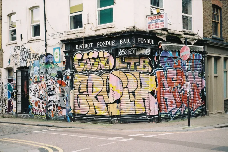
Look up above the vape shop, past the plastic fascia and the roll-down shutter, and you’ll often find a rectangle of brick that’s a slightly different colour to the rest. That patch is a ghost sign. Sometimes the lettering is still there — pale, flaking, but legible — advertising a grocer, a brewery, a brand of polish or a bicycle that nobody has manufactured since the Wilson government. It’s one of the quiet pleasures of a British high street, and also, if you make or commission signage for a living, one of the more useful things to study.
A Short Life and a Long Afterlife
Wall advertising exploded in the late nineteenth century. As towns grew and brick terraces went up, the side of a building became prime real estate — often more visible than the shopfront itself. Signwriters would be hired to paint directly onto the render or brick, usually in oil-based lead paint, working from a ladder with a maul stick and a pot of something the colour of clotted cream.
The golden stretch ran roughly from the 1880s to the 1950s. Bovril, Hovis, Gillette, Bryant & May matches, endless local breweries and independent grocers — all of them bought the side of a building and had their name written across it in letters a foot high. Then the medium changed. Prefabricated fascia boards, illuminated boxes, plastic lettering and eventually vinyl arrived, and the wall painters quietly went out of business. The old signs were left where they were, mostly because overpainting a brick wall is a job nobody wants. Sixty years of sun and rain later, we call them heritage.
Why the Old Ones Are Still Readable
Strip away the nostalgia and the survival of these signs is not really a mystery. It comes down to a handful of decisions that were made by signwriters who had no idea they were designing for a seventy-year lifespan.
The palette was tiny. Most wall signs used two or three colours at most. A cream ground, a dark blue or black letter, maybe a red accent. There’s nothing to clash, nothing to date, nothing to fade at a different rate to everything else.
The hierarchy was brutal. Brand name first, product second, address third — and each one a clearly different size. You can read the whole thing from the other side of the road, which is the only place anyone ever read it from in the first place.
The lettering was drawn, not typed. A signwriter’s capitals have a bit of give in them. The strokes are consistent, the spacing is tight, and the shapes are simple enough that a chipped edge doesn’t destroy the letter. Compare that to a fine-serif logotype rendered in vinyl, where losing half a millimetre of a hairline stroke turns an S into something that looks like a 5.
Should You Restore the One on Your Building?
If you’ve bought or leased a property with a ghost sign on it, you’ll eventually have the conversation: do we paint over it, tidy it up, or leave it alone? There’s no single right answer, but there is a sensible order of operations.
First, check whether the building is listed or in a conservation area. If it is, any work to the exterior — including repainting a historic sign — will need consent, and your local conservation officer will have a view. Most of them would rather see a sign conserved than covered, but they’ll want to know exactly what paint you’re using and how reversible the treatment is.
Second, resist the urge to ‘restore’ by repainting the whole thing in bright new colours. A ghost sign’s value is partly in its fading. Overpainting it turns it into a modern advertising hoarding wearing a vintage costume. If you want the original legible, the standard approach is consolidation rather than replacement: stabilise the flaking paint, match the existing pigment as closely as possible, and only touch in the areas that have actually failed.
Third, if you’re commissioning new paintwork on an old wall, hire a signwriter rather than a vinyl shop. This isn’t snobbery. Hand-painted lettering sits on brick and render in a way that cut vinyl can’t, and when it does start to weather, it wears in a way that still looks deliberate. Vinyl peels from the edges inwards and looks broken almost immediately.
Specifying Paint That Ages Gracefully
Modern paint is very good, but it’s mostly been formulated to look perfect for five years rather than decent for thirty. If longevity matters, the specification needs to be a bit old-fashioned.
Traditional signwriting enamels — oil-based, slow-drying, high in pigment — still exist and still outperform most water-based alternatives on porous masonry. They need a properly primed surface, and they need a signwriter who knows how to lay them off without brush marks. On brick, a breathable masonry primer matters more than the topcoat; if moisture can’t get out through the paint, it will find a way out through the brick, and it will take the paint with it. Lime render behaves differently again and wants a mineral paint that lets the wall move.
If you’re specifying for a coastal site or a west-facing wall, expect a shorter cycle and budget for a refresh every eight to twelve years. Inland and sheltered, a good oil-based job can easily see out fifteen. And always look at the wall from the distance the sign will actually be viewed from before you sign anything off — signs that are ‘good from far, far from good’ are usually the ones that were inspected at arm’s length.
The Brand That Doesn’t Blink
The quiet lesson of the ghost sign is not really about paint. It’s about restraint. The brands still legible on those walls — Bovril, Hovis, Gillette — are the ones that didn’t redesign their identity every three years. Their marks were simple enough to be painted by hand in a morning and strong enough to still read when half the paint had gone.
There’s a commercial argument buried in that. A sign is a long-term asset, and a brand that keeps changing its clothes never gives any single piece of signage time to become part of the street. The irony is that the businesses most obsessed with looking current leave the shallowest mark, while the ones that quietly stuck to their lettering ended up as accidental heritage.
You probably aren’t going to be around in seventy years to see how your fascia weathers. But the wall will be. It’s worth specifying something it can remember you by.