What Your Sign Charges Before You Do
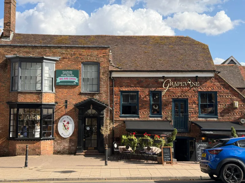
There is a two-second conversation that happens before anyone speaks to you. A passer-by glances at your shopfront, and in that glance they decide roughly what you charge, how good you are, and whether they can be bothered. The sign does most of the talking.
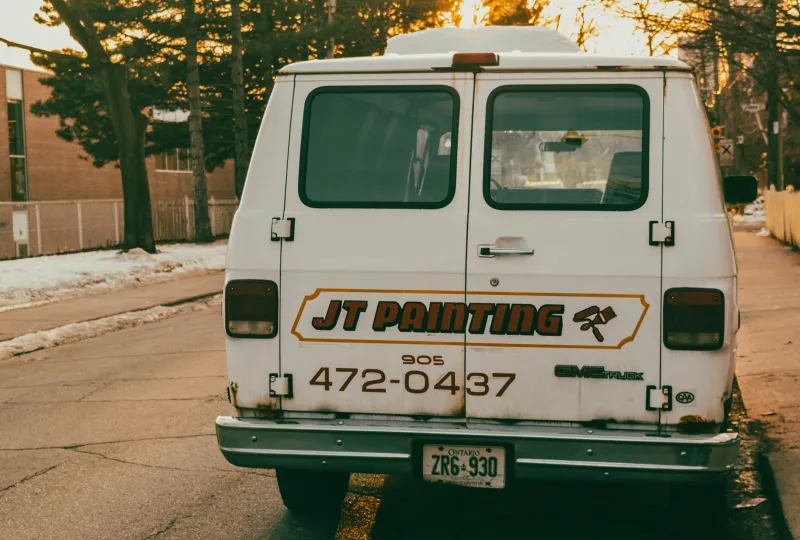
You can see it play out on any high street. Two cafés, fifty yards apart, both selling a flat white for £3.60. One has crisp aluminium letters on a matt fascia, clean shadow gaps and a bracket that sits dead level. The other has a vinyl banner that has gone the colour of weak tea and a hanging sign that leans like it is listening to someone. Same coffee. Different expected price. The first one can probably charge £3.95 and nobody would blink. The second one could drop to £3.20 and still feel like a risk.
That gap is not about snobbery. It is shorthand.
The number customers read before the menu
People use the look of a business as a proxy for how it is run. It is not fair and it is not always right, but it is consistent. A sharp sign suggests a tidy operation, someone who notices things, a business that will still be there next quarter. A tired sign suggests the opposite: that the margins are thin, that maintenance is someone else's problem, that the last refurbishment ran out of budget halfway through.
None of this is conscious. Customers do not stand there assessing your edge finishing. They simply arrive at a feeling, and that feeling becomes a price they are willing to pay.
Material is a sentence about your standards
Material choice tells a story whether you intend it to or not. Foamex is not a dirty word — it is a sensible, lightweight, weather-resistant board and it has kept plenty of good businesses dry. But a foamex panel stuck to a listed stone frontage in a market town is a mismatch, and passers-by read that mismatch as improvisation.
The question is not what is the most expensive material. It is what material matches the promise being made inside. A premium interiors shop with a cheap-looking fascia reads as a business that talks better than it delivers. A trade counter with over-polished brass and backlit lettering can read as trying too hard, which is its own kind of wrong.
Aim for coherence. If you want to sit in the middle of the market, a well-made aluminium composite or acrylic-faced sign with a clean edge will do more for you than a bargain bucket of gold-effect lettering. If you want to sit at the top, the material needs to be genuinely good, not just shiny.
Finish is where the truth leaks out
Most bad signs are not badly designed. They are badly finished. The vinyl has a silvered edge because it was applied in a cold workshop. The fixings are visible and not quite in line. The letters are level individually but not level with each other. The fascia has a ripple in it that catches the light at four o'clock.
Customers cannot name any of this. They just get the nearly feeling — the sense that something is almost right, which is often more damaging than something that is plainly basic. A plain sign that is well made looks intentional. A complicated sign that is nearly right looks careless.
Lettering: handmade or home-made?
Lettering is where a lot of businesses try to get personality cheaply, and where it goes wrong fastest. Three typefaces, a drop shadow, a swoosh, an outline and a gradient is not branding. It is a ransom note.
The signs that age well tend to use one typeface family, two weights at most, and enough space around the letters to let them breathe. That is not a rule about taste; it is a rule about legibility and confidence. Confident lettering does not need to shout. Cheap lettering is not about the price of the letters — it is about the amount of thought that went into them.
Maintenance is a monthly subscription to your reputation
Britain is hard on signs. Rain gets into seams, fixings corrode, vinyl lifts at the corners, and LED modules fail in inconvenient little segments. A single dead letter can turn Bakery into Bak ry and make a perfectly good shop look abandoned.
The fix is boring and cheap: a quarterly walk-round with a cloth and a screwdriver. Check the seals, check the brackets, check that the letters are still doing what they did on day one. If something has failed, fix it before it becomes the thing people remember. A sign is not a one-off purchase; it is a small ongoing promise that you are paying attention.
Where the money should actually go
Spend on the things people see at arm's length and in the rain. The fascia face, the main lettering, the frontage lighting and the fixings. Those are the four places where a little more budget buys a disproportionate amount of perceived quality.
Save on complexity. Every extra flourish — the bevelled edge, the second material, the backlit logo that only works after dark — is another thing that can go wrong and another thing that has to be maintained. Simple, well-made signage almost always beats complicated, nearly-made signage.
And do not spend on apology. If your sign is trying to explain that you are better than you look, it is already too late. The sign should not be a disclaimer.
The price bracket is built into the wall
None of this means you need to remortgage the shop. It means the sign has to agree with the price list. A customer who sees a considered, tidy, well-fixed frontage will accept a higher price as normal. A customer who sees peeling vinyl will question every number on the menu, and probably ask for the cheapest thing on it.
That is the quiet power of a good sign. It does not sell for you. It just removes the doubt that makes people haggle with themselves before they walk in. Get that right, and the price on the wall stops being a barrier and starts being a fact.