Before the Router Bites: Stress-Testing Your Logo for the Signage Workshop
A logo can look immaculate on a studio monitor and then turn into a fuzzy, pinched smudge on a foamex panel above a shop door. It is not usually a bad logo. It is a logo that has never been asked to survive a workshop. At Amr Signs, we spend a lot of time translating screen artwork into things that live on walls, windows and door plates. The trick is to stress-test the mark before the router, the roller or the rain gets a vote.
This is not about redesigning your brand. It is about adaptation: finding the version of your mark that can be cut, routed, printed, painted and read at the distances that matter. Think of it as a pre-flight check for signage.
Start with the vector, not the vibe
The first test happens before any material is chosen. Open the artwork at a sensible size and look at the paths. Are the strokes expanded or still live? Are there stray anchor points, clipping masks, hidden layers or effects that only exist in the design file? A sign maker needs clean geometry, not a flattened screenshot.
Hairlines are the classic casualty. A stroke that looks elegant on a 27-inch screen can be thinner than a vinyl blade can weed, or thinner than a router bit can cut without tearing. As a rough rule, anything under 1mm at final size deserves a conversation. At small door-plate sizes, 1mm is already ambitious. If the mark relies on spidery lines, expect to thicken them slightly for fabrication. The shape stays; the engineering changes.
Counters, corners and the router bit
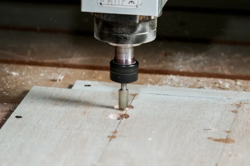
Tight counters — the enclosed spaces in letters like e, a, o and g — are another weak point. At 20mm tall, a counter that looks generous on screen can close up completely in cut vinyl or engraved brass. The same goes for internal corners: a router bit has a diameter, so it cannot cut a perfect sharp internal angle. It leaves a radius. If your logo depends on needle-sharp notches, the workshop will either soften them or use a different process.
This is why we test at actual size, not just at poster size. Print the mark at 15mm, 30mm, 60mm and 200mm high. Pin them to a wall. Walk back five metres. If the small version becomes a blob, you need a simplified variant — perhaps a monogram or a wider lockup — for door plates, vehicle decals and wayfinding.
Gradients, glows and screen-only tricks
Smooth gradients are lovely on a website. In signage they are a negotiation. Printed vinyl can reproduce them, but the fade may look banded at close range and the lamination can shift the colour. Routed letters cannot do gradients at all unless you use multiple materials, which multiplies cost and fuss. Illuminated fascias diffuse light, so a subtle gradient often washes out into a pale ghost.
Drop shadows, inner glows and 3D bevels are similar. They can work in a printed graphic, but they rarely survive as cut shapes. The practical answer is usually to flatten the mark to solid colours for fabrication and keep the fancy version for digital use. A signage-safe lockup with one or two colours will read faster from the pavement anyway.
The grey-scale and squint tests
Colour contrast is where many otherwise sturdy logos fail. A pale grey wordmark on a white fascia looks refined in a brand book and practically disappears on an overcast Tuesday in Manchester. Before committing, convert the logo to greyscale. If the contrast collapses, the sign will struggle in low light, at speed and for anyone with reduced vision.
Then do the squint test: stand back, half-close your eyes and see what remains. You want the silhouette and the main colour blocks to hold. If the mark only works when you are close enough to read the strapline, it is not doing its job as a sign.
The material gauntlet
Different processes expose different weaknesses. A quick run-through:
- Cut vinyl: fine details can lift, weed badly or trap air. Thin strokes and isolated dots are the enemy. Bridges in letters need enough width.
- CNC routing: internal corners get a radius. Serifs and very fine terminals may need simplification. Acrylic can chip if the geometry is too delicate.
- Printed panels: gradients and photographs are possible, but small reverse-out type can fill in. Lamination adds durability but can slightly dull the colour.
- Hand-painted lettering: brush width sets a minimum stroke. Very tight curves and hairline serifs ask a lot of the painter and the surface.
- Illuminated fascias: diffusion is everything. Thin strokes can hotspot; large solid areas can look uneven. The logo may need a wider stroke or a halo-lit approach.
- Etched or engraved plates: shallow lines disappear under oblique light. Contrast comes from fill or depth, not just the line itself.
Change the lockup, not the brand
The good news is that you rarely need a new logo. You need a family of lockups: the full colour version for print and web, a one-colour version for vinyl and engraving, a compact monogram for small plates, and perhaps a horizontal or stacked variant for fascias. Each one should be recognisably yours, but built for the conditions it will meet.
Get the brand owner or designer to sign off these variants before fabrication. A sign maker can advise on thickness and contrast, but the final call on the mark belongs with the people who own it. The best outcomes happen when the designer and the workshop talk early, rather than after the first proof looks wrong.
A pre-fabrication checklist
Before you send artwork to be made, run through this:
- Is the artwork vector, with strokes expanded and effects flattened?
- What is the smallest stroke width at final size?
- Do the counters stay open at door-plate size?
- Have you checked internal corner radii against the router bit?
- Does the mark still work in one colour?
- Does it survive greyscale and the squint test?
- Have you viewed a 1:1 proof from the intended reading distance?
- Are there screen-only gradients, glows or shadows that need a signage-safe alternative?
- Have you chosen the lockup for each application — fascia, window, vehicle, plate?
- Has the fabricator confirmed fixings, substrate and finish?
A logo is not fragile, but it is context-sensitive. The mark that wins on a phone screen may need a little help on a wet high street. Stress-testing it now saves the sigh later — and keeps the sign looking like the business it belongs to.