The Other Half of the Sign: Lighting Choices That Make or Break After Dark
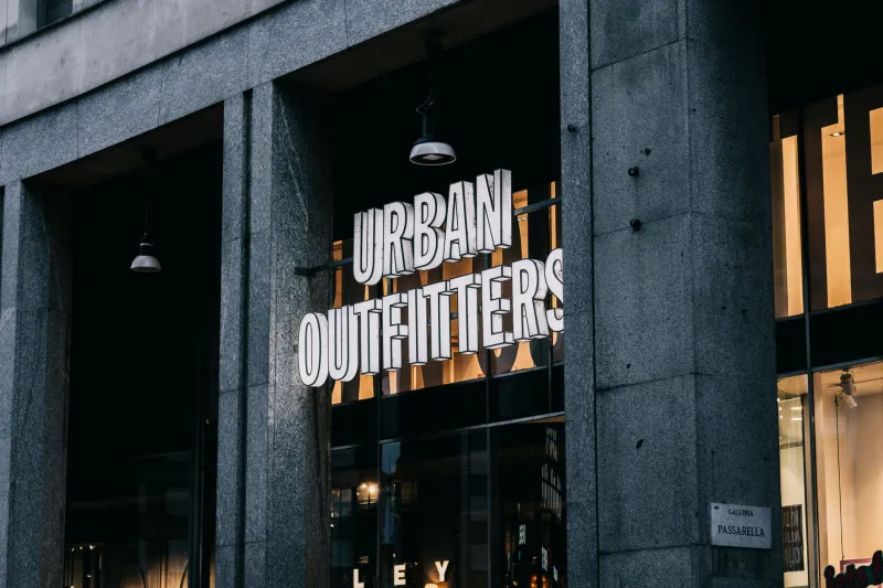
Most signage briefs are written in daylight. You stand on the pavement, squint at a proof, argue about the shade of blue and agree the letter height. Then everyone goes home. But for a large chunk of the year in the UK, the sign's most visible shift starts around 4pm. If the lighting has not been thought through, the sign that looked sharp at noon can turn into a fuzzy glare bomb by teatime.
At Amr Signs, we treat exterior lighting as part of the sign, not an accessory bolted on at the end. Here is how to spec it so the after-dark version looks as considered as the daytime one.
Daylight is only half the brief
A sign has two audiences. In daylight, people read shape, colour and contrast. After dark, they read glow, spill and silhouette. The same letterform can behave completely differently when lit. A deep navy fascia that looks rich at noon can go flat and murky under a cool white LED. A slim logo that reads cleanly in sunshine can bloom into a soft blob if the face is over-lit.
That is why lighting should be decided with the artwork, not after the fixings are chosen. The question is not simply 'can we light it?' but 'what should it look like when the street is dark and the shop window is the brightest thing around?'
Halo-lit or face-lit? Decide the effect first
Halo-lit letters are lit from behind. The light washes the wall and leaves the letter face dark, so the word floats as a soft outline. It is a quieter, more architectural look. It suits restaurants, hotels, salons and signs on textured brick or stone, where the wall itself becomes part of the effect. The catch is that halo lighting needs a clean, flat background and a decent standoff. On a lumpy wall, the glow will show every imperfection.
Face-lit letters are illuminated through the front. Acrylic faces, push-through letters and illuminated panels all fall into this camp. They are direct and highly visible, which is useful on a busy high street or a parade of shops where you are competing with bright windows. The risk is hot spots. Thin strokes, shallow returns and cheap diffusion can make a face-lit sign look patchy, especially where LED modules are spaced too far apart.
Neither method is automatically better. Pick the effect you want at night, then let the workshop detail the build around it.
Colour temperature: not all white is the same
LED colour temperature changes the mood of a sign more than most people expect. Warm white, around 2700K to 3000K, feels familiar and welcoming. It sits well with brick, timber, awnings and traditional shopfronts. Neutral white, around 4000K, feels crisper and more commercial. Cooler temperatures can work with glass, metal and modern facades, but they can also look clinical next to a warm window display.
The important thing is consistency. If your fascia sign is warm white and your window graphics are lit with cool white strips, the building looks like two different businesses sharing a doorway. Ask for the colour temperature to be stated on the quote, and keep it consistent across the elevation. If the sign is in a conservation area or attached to a listed building, check any lighting conditions carefully before assuming a particular look is acceptable.
Brightness and glare: light the sign, not the street
An overbright sign is not a bold sign. It is a glare source. It can wash out the lettering, annoy the flats above the shop and make neighbours feel like they are living opposite a football stadium. In some locations, planning conditions will set limits on illumination or require a curfew. Even where there is no formal restriction, restraint is part of good craft.
Aim the light at the sign, not the pavement. Use shields, hoods or recessed fittings where necessary. Ask for a dusk sample or a lighting calculation rather than judging brightness from a workshop test under fluorescent tubes. Brightness is not a substitute for contrast. A well-balanced sign at moderate output will usually read better than a blazing one that turns the fascia into a white rectangle.
Timers, photocells and curfews
A sign that switches on at dusk and off at midnight needs a plan for both ends of the evening. Photocells are the simple option: they respond to ambient light and switch the sign on as the street darkens. Timers and astronomical time clocks are more predictable, especially if you want a fixed curfew or a dimming period after a certain hour. A combined approach is common: photocell for dusk, timer for curfew.
Think about how the sign will be controlled in practice. Is there a manual override for maintenance? Is the lighting on its own circuit? Is the driver accessible? A sign that can only be switched off by tripping the whole shop is a nuisance. A sign that dims automatically after closing time is a better neighbour and often a better brand statement.
Maintenance access: design it in
LEDs are reliable, but drivers fail and connections can loosen. If the driver is sealed inside an unvented box or hidden behind a fixed panel, a simple repair becomes a major job. Design access in from the start. Remote drivers in a serviceable location are often easier to maintain than drivers crammed behind the letter returns. Keep fixings reachable, allow ventilation and make sure the installer records the driver location and replacement part numbers.
IP ratings matter too. A sign may face driving rain, wind-driven grit and long damp spells. The fittings and connections should be suitable for the exposure, not just the first dry week. A sign that cannot be maintained becomes a dark rectangle with a nice memory.
A short spec checklist
Before you sign off the quote, confirm the lighting effect, the LED colour temperature, the dimming or curfew arrangement, the photocell or timer control, the driver location, the IP rating, glare control and the maintenance plan. Ask to see a sample at night if the sign is prominent or the budget allows. It is much easier to adjust a mock-up than a finished fascia.
The sign after dark is still the brand
A sign does not stop being your brand when the sun goes down. If anything, it works harder, because there is less visual noise around it. Get the lighting right and the sign feels intentional at 11pm as well as 11am. Get it wrong and all that daylight design work disappears into a glow. Spec the night shift properly, and the sign earns its keep around the clock.