First Impressions Don't Ring Ahead: Building Credibility Into Your Frontage

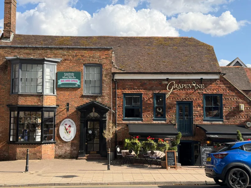
Photo: Danny Robinson, CC BY-SA 2.0, via Wikimedia Commons
Most customers do a reference check before they ever speak to you. They just don't call it that. They clock the sign above the door, the lettering on the van, the way the window graphics have lasted through a few winters. If those things look considered, they assume the work behind them is considered too. If they look tired, patched up or oddly provisional, the doubt arrives before the first hello.
For a small UK service business — a plumber, a consultant, a clinic, an independent shop — that matters more than it does for the big names. Nobody expects a national chain to feel personal. They do expect a local operator to feel real. Your signage is often the first piece of evidence they get.
The quiet arithmetic of a credible frontage
Trust rarely arrives in one dramatic gesture. It accumulates in small, dull details: a fascia that fits properly, a door sign with the right opening hours, a phone number that hasn't been half-scratched off. Customers may not analyse any of this consciously, but they read it all the same.
A credible sign tends to do three things at once. It says what you do, it says where you are, and it says you intend to still be there next year. That last point is the one people underestimate. Materials, finish and maintenance are not just workshop matters. They are brand messages.
Materials that say “we'll still be here”
A sign doesn't have to be expensive to look dependable. It has to be appropriate. Powder-coated aluminium, rigid composite panels, quality acrylic lettering and properly applied vinyl on a suitable substrate will all do honest work on a British high street. What undermines credibility is the mismatch: outdoor lettering that was never meant for weather, or a clever material used where a straightforward one would last longer.
If your premises face prevailing wind and rain — and most do — choose finishes that can take it. Matt surfaces hide marks better than high gloss. Deep colours show dust less than pale ones. Fixings should look deliberate, not improvised. A sign that has been screwed on as an afterthought tells customers something, even if they couldn't name it.
It also helps to think about repair. A sign you can clean, re-fix or partially replace is a sign you can keep looking sharp. That is a more credible long-term position than a one-off installation nobody can touch up.
Placement: the eye-line test
Good placement is mostly about meeting people where they actually look. Customers approach from the pavement, from a car park, from the side street, from the bus stop. They are not standing still with their hands folded.
Walk the route they walk. Stand where they stand. Can you read the sign before you've decided to look for it? Is the entrance obvious? If the door is set back, does something at street level tell people they've arrived? Are your opening hours visible at the point of hesitation, or hidden around the corner?
For tradespeople and mobile services, the same logic applies to the van and the site board. For clinics and consultants, it applies to the door plate, the intercom and the waiting-room sightline. Credibility lives at the decision point, not in the middle of a perfectly composed photograph.
Messaging: less boast, more proof
A trust-building sign doesn't need a paragraph. It needs the basics done cleanly: your name, what you do, where you work, how to reach you. If you have genuine credentials — a professional body, a registration, a qualification — they can help. If you don't, don't invent visual shortcuts. Customers are reasonably good at spotting decoration dressed up as authority.
Avoid clutter. Too many badges, fonts and claims make a small business look anxious. A calm hierarchy is more persuasive: name first, service second, contact third. Keep the wording plain. “Emergency plumbing” is more useful than “plumbing solutions”. “Appointments available” is clearer than “wellness journeys”.
And make sure the details match everywhere. The phone number on the fascia should match the one on the door, the van and the website. Inconsistency is a small thing that feels like a large thing.
A simple frontage audit for owners
Stand outside your premises on a normal working day and ask:
- Can I read the main sign from the pavement without squinting?
- Does it look clean, straight and properly fixed?
- Is the entrance obvious to someone who has never been here?
- Are the opening hours and contact details visible before I hesitate?
- Does the lettering still look sharp at the edges, or is it peeling and fading?
- Is the material right for the weather it faces?
- Does the sign match the van, the website and the paperwork?
- Have I removed old stickers, outdated logos or temporary notices that have quietly become permanent?
- Does the sign say what I actually do, in words a customer would use?
- Would I trust this frontage if I were about to spend money with the business behind it?
None of these questions require a redesign. Most require a Saturday morning and a critical eye. That is the useful thing about credibility: it is often less about buying something new than about finishing what is already there.
Your sign may never get a formal reference check. But it is being read all the same. Make sure it is saying the right things before anyone rings.